How I Build My Jamstack Site With Hugo, Cloudflare Pages and Git?
• Reading Time : 5 minFor a long time, I wanted to create a site to transfer my notes and share my experiences. Two important points were both adapting to the developing Jamstack trend and creating a completely self-produced theme that fits the semantic html structure.
Thus, at the beginning of 2023, I have set up this site generated by Hugo, design was built on Pico CSS and deployed fromGithub with Cloudflare Pages through the repository. In this article, I will talk about how I created this site with Hugo, Cloudflare Pages and Git and what I want to add over time, rather than the topics I want to mention.
First of all, my first choice for this site was that it had a very fast and readable design. I knew I wanted a static Jamstack site for maximum performance. Also, the generator had to be static for quick and easy publishing performance. Thus, the structures I used in the generator, design and deployment phase were formed as follows.
Static Site Generator
I have already used Hugo for different purposes for the last three or four years. I chose it because of the comfortable development environment it provides and of course the tremendous build speed. Hugo allows me to create my posts with multi language support in a simple way. I can also control the theme components for these two languages with a simple i18n file. Even though I consider the needs according to the projects and make my choices related, I will probably use Hugo for my new works unless there is a different situation.
Design
In terms of design, the framework I was going to use had to be flexible, allowing me to do everything from scratch for full customization. For this, I decided to use Pico CSS with dark mode automatically enabled, elegant styles for all native HTML elements, semantic structure and no classes. Since there are no use of classes in html codes such as Tailwind CSS even using Bootstrap, it has been a very suitable structure for thematic changes in the future because I have already assigned the ones myself. Pico CSS offers such nice simplicity that it allowed me to default and use Segoe UI without using any external or non-standard fonts.
Deployment
Frankly, the easiest part of the job was deployment. There are so many good alternatives on Jamstack platforms; Netlify, Vercel and Cloudflare Pages are some of the highlights. Although I have a few sites running on Netlify, I used Cloudflare Pages here for performance. Honestly, I think it’s enough for a site like this.
Workflow
All the code of the site and the theme live in a repository on Github see. After I write my article with Markdown, when my editing is done and complete my checks, I send it to the repository with git push. As soon as Cloudflare Pages detects the change, it starts building the site and becomes live at alperorus.pages.dev in about 30 seconds. I have a CNAME record pointing to the pages environment that concurrently spawns in the domain alperor.us. In summary, in about a minute from the git push command, the site goes live over the domain name.
All these are free with ssl setup, cache feature, minified css js support and limited analytics service. Hugo already automatically generates and serves my sitemap and RSS feeds.
Performance
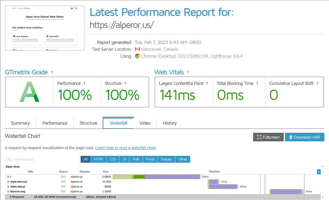
My purpose in the design section with the philosophy of simplicity and readability in general. I specifically removed font icons for performance and continued with svg icons. I’ll probably find a nice set and go for a general icon change at the appropriate time to ensure integrity. After the introductory articles, the site’s lighthouse performance score was 100%. At the same time, I was able to see 100% again on the SEO side.

512K Club
I came across the 512K Club during my research questioning the performance. 512KB Club is a collection of performance-oriented web pages on the Internet. Your Total UNCompressed web resources must not exceed 512 KB for your website to qualify. The goal is to draw attention to today’s bloated internet. To make a difference for this, the platform believes that every webmaster can contribute to this with a little bit of optimization. Simple inquiries include:
- Do you really need the extra piece of JavaScript?
- Does your WordPress site need a theme that adds lots of functionality you’re never going to use?
- Do you really need those large-size custom fonts?
- Are your images optimized for the web?
Frankly, I also think that this is necessary for a sustainable internet. The 512K Club would like to see the waterfall tab in the GTMetrix scan of the site to see this metric. In the early stages of the design, I was able to reach the orange area, that is, under 250K. However, thanks to my recent edits and optimizations, I have reached uncompressed 87KB for the entire site. Even the compressed size is 18KB :) which is quite pleasing. The green zone badge at the bottom of the site is important for the value of doing hard work and what it teaches.

To do list
At the end of the article, I would like to make notes for a reminder. This will be a list of what I can add or change to the site from now on.
- Site-wide SVG icon set
- A new listing template for Taxonomy
- Hugo data cvs loop for citations
- Edit top spacing
- Replace Hugo partial files with cached
- Which commenting system?
If you have any feedback about the theme that is missing or what can be done, you can do it from the contact page. Thanks for reading.